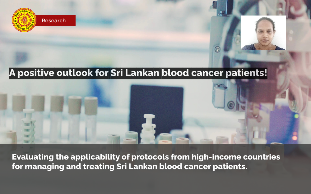
Dr. Chathuri Jayasinghe of Department of Statistics, USJ recently collaborated with a team from Lanka Hospital Blood Cancer Centre (LHBCC) to conduct multiple studies with the aim of investigating the applicability of treatment protocols from developed countries to treat and care for Sri Lankan blood cancer patients. The studies evaluated the treatment and care outcome for local patients with adult acute Myeloid Leukaemia, Hodgkin Lymphoma, Plasma Cell Myeloma and were shown to be comparable to high-income countries (1, 2, 5, 6). At present locally, there is excessive mortality for blood cancers that are potentially curable in the west (1). Further, there is a scarcity of Sri Lankan data particularly for these cancers and scant research in the literature.
Dr. Jayasinghe contributed to the conception, design, acquisition, analysis of data and publishing of these multiple researches conducted by the team led by Dr. Saman Hewamana of LHBCC. Results of these studies which were mainly derived using survival analysis techniques with expertise of Dr. Jayasinghe suggests that mortality can be reduced and the burden on the health care system can be minimized if diagnosed and treated in an appropriate setting. Apart from treating blood cancers, LHBCC has also trained the first-ever group of haemato-oncology trainees from government hospitals. This holds promise for blood cancer care in Sri Lanka and will give trust and belief to patients and medical staff alike about the achievable targets.
Another recent research study published by the group has shown blood cancer care can be continued safely during the Covid-19 pandemic if proper strategies are implemented and that this would help to prevent late stage presentation and adverse outcomes (3). In another study, the management and mortality of neutropenic episodes among Haemato-Oncology patients were investigated and the manuscript that was written based on its findings is currently under review (4).
Dr. Chathuri Jayasinghe research interests include survival analysis methods and applications, nonparametric and parametric estimation methods, medical statistics and software reliability growth models. Her fundamental research work related to these areas has been published in journals such as IEEE Transactions on Reliability, the Journal of Statistical Planning and Inference, the Communications in Statistics (Theory and Methods).
Related references:
- Saman Hewamana, Lakmali Kandabadage, Thurairajah Skandarajah, Natasha Pieris, Eranga Perera, Mahesh Harischandra, Ananda Wijewickrama, Chandana Wickramarathna, Gnani Somasundaram, Vadivelu Srinivasan, Surjit Somiah, Priyankara Jayawardena, Mehendra Perera, Dehan Gunasekera, Chathuri Jayasinghe, Godvin Constantine, Sanjeewa Munasinghe, Chandu De Silva, Bandula Wijesiriwardena, Jayantha Balawardena. Applicability of Western protocols in resource-limited setting: Real-world data of long-term outcome of intensive treatment of adult acute myeloid leukaemia in Sri Lanka. eJHaem. 2021; 2: 555– 561. https://doi.org/10.1002/jha2.191
- Saman Hewamana, Lakmali Kandabadage, Thurairajah Skandarajah, Natasha Peiris, Sobitha Abeyaratne, Gehan Arseculeratne, Eranga Perera, Mahesh Harischandra, Ananda Wijewickrama, Gnani Somasundaram, Vadivelu Srinivasan, Surjit Somiah, Priyankara Jayawardena, Rohini Wadanamby, Geethani Galagoda, Chathuri Jayasinghe, Chandu De Silva, Sanjeewa Munasinghe, Bandula Wijesiriwardena, Jayantha Balawardena. Applicability of protocols from high-income countries in a resource limited setting; real world data of histopathology, clinical features and long-term outcome of Hodgkin Lymphoma in Sri Lanka, The Lancet EClinicalMedicine, Volume 38, 2021, 100998, ISSN 2589-5370, https://doi.org/10.1016/j.eclinm.2021.100998.
- Saman Hewamana, Thurairajah Skandarajah, Chathuri Jayasinghe, Samadhi Deshapriya, Dhananjani Senarathna, Dilip Gayashan, Natasha Peiris, Eranga Perera, Mahesh Harischandra, Surjit Somiah, Nihal Munasinghe, Sangeetha Hewawasam, Gehan Arseculeratne, Rohini Wadanamby, Geethani Galagoda, Jayantha Balawardena. Blood cancer care in a resource limited setting during the Covid-19 outbreak; a single center experience from Sri Lanka. PLOS ONE, 16(9), e0256941 (2021). https://doi.org/10.1371/journal.pone.0256941
- Saman Hewamana, Thurairajah Skandarajah, Chathuri Jayasinghe, Samadhi Deshapriya, Dhananjani Senarathna, Gehan Arseculeratne, Mahesh Harischandra, Gnani Somasundaram, Vadivelu Srinivasan, Surjit Somiah, Nihal Munasinghe, Sangeetha Hewawasam, Lalith Ekanayake, Rohini Wadanamby, Geethani Galagoda, Thet Thet Lin, Jayantha Balawardena. Adapting Supportive Care Guidelines from High-income Countries; Real World Data on Approach to Neutropenic Sepsis in Haemato-Oncology Patients in Sri Lanka, 15 July 2021, PREPRINT (Version 1) available at Research Square [https://doi.org/10.21203/rs.3.rs-626896/v1]
- Saman Hewamana, Prasanna Gunasena, Chathuri Jayasinghe, Mahesh Harischandra, Thurairajah Skandarajah, Sobitha Abeyaratne, Lalith Ekanayake, Gnani Somasundaram, Surjit Somiah, Vadivelu Srinivasan, Gehan Arseculeratne, Neomal Perera, Jayaindra Fernando, Nihal Munasinghe, Ashfaq Mowlana, Samadhi Deshapriya, Supun Mawathakubura, Chandana Wickramarathna, Ananda Wijewickrama, Priyankara Jayawardena, Eranga Perera, Natasha Peiris, Sarath Paranawithana, Chithranga Perera, Sanjeewa Munasinghe, Chandu De Silva, Rohini Wadanamby, Geethani Galagoda, Thet Thet Lin, Bandula Wijesiriwardena, Jayantha Balawardena; Survival estimates of patients with plasma cell myeloma after first line therapy in a resource limited setting using protocols from high-income countries. October 2021, Submitted.
- Saman Hewamana, Prasanna Gunasena, Chathuri Jayasinghe, Mahesh Harischandra, Thurairajah Skandarajah, Sobitha Abeyaratne, Lalith Ekanayake, Gnani Somasundaram, Surjit Somiah, Vadivelu Srinivasan, Gehan Arseculeratne, Neomal Perera, Jayaindra Fernando, Mazhar Faiz, Nihal Munasinghe, Ashfaq Mowlana, Samadhi Deshapriya, Supun Mawathakubura, Chandana Wickramarathna, Ananda Wijewickrama, Priyankara Jayawardena, Eranga Perera, Natasha Peiris, Sarath Paranawithane, Chitranganie Perera, Chitranga Kariyawasam, Sanjeewa Munasinghe, Chandu De Silva, Rohini Wadanamby, Geethani Galagoda, Thet Thet Lin, Bandula Wijesiriwardena, Jayantha Balawardena; Feasibility of transplantation for plasma cell disorders in resource constrained setting; real-world data on safety, survival and cost of treatment from the first blood cancer centre in Sri Lanka. In preparation.


